Ditto.Care

“What’s up, doc?” Tell me what’s going on, but in words a human can actually digest. That’s Ditto’s job: translating complex care info into plain language. Together with Paulus, we gave them a visual system that feels approachable, calm, and clear. A reliable companion, just like Ditto the Pokémon.

  • Brand Strategy
  • Brand Identity
  • Design System
  • Presentation Design
  • App Design
  • Logo Animation
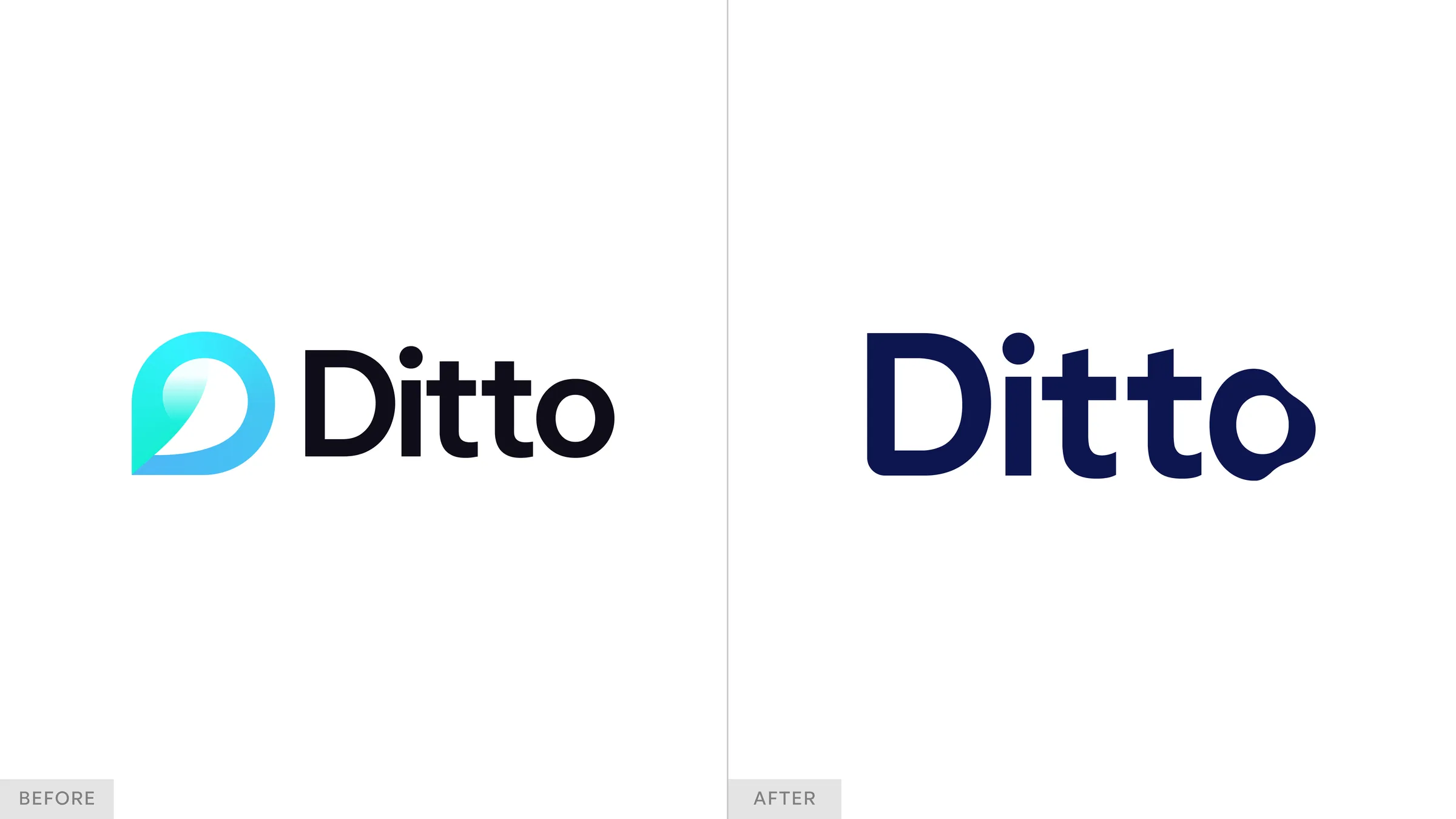
Ditto logo before and after the rebrand
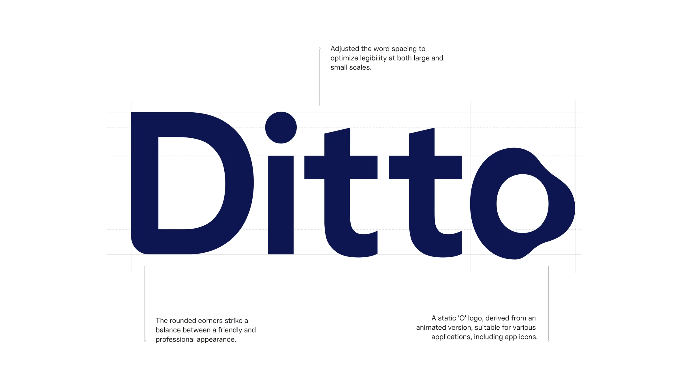
Construction of the Ditto wordmark with notes on corners and the O
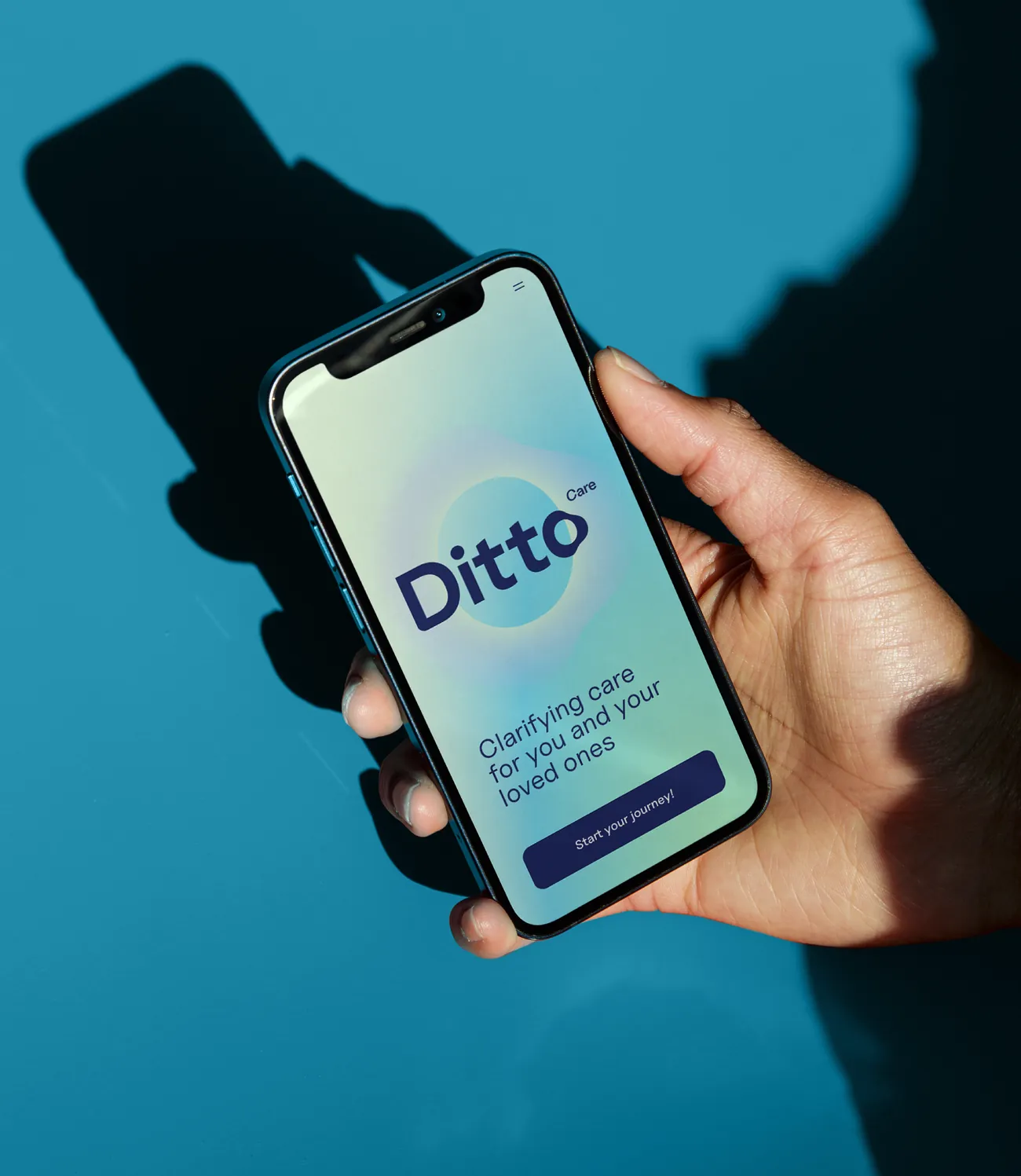
Ditto app splash screen on a phone held against a blue wall
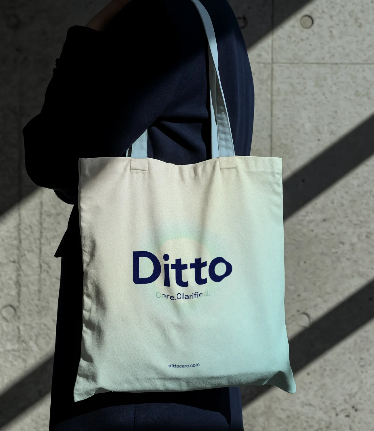
Ditto tote bag with Care. Clarified.
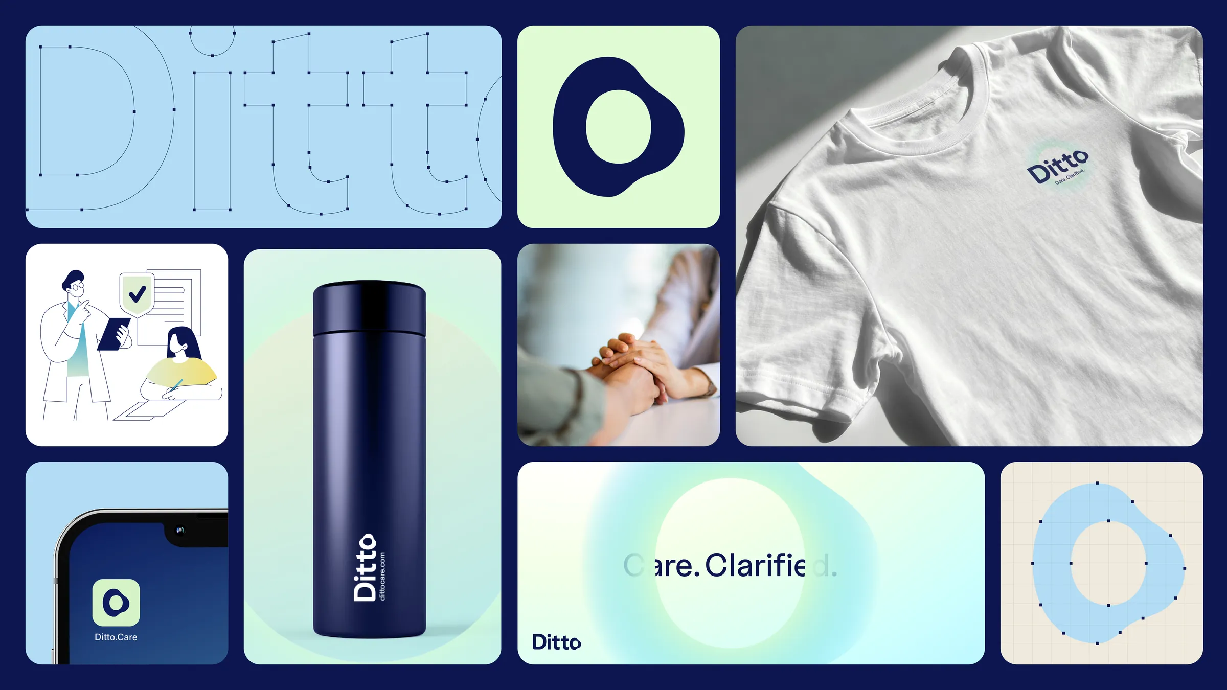
Ditto identity overview: wordmark, O symbol, merch and app icon
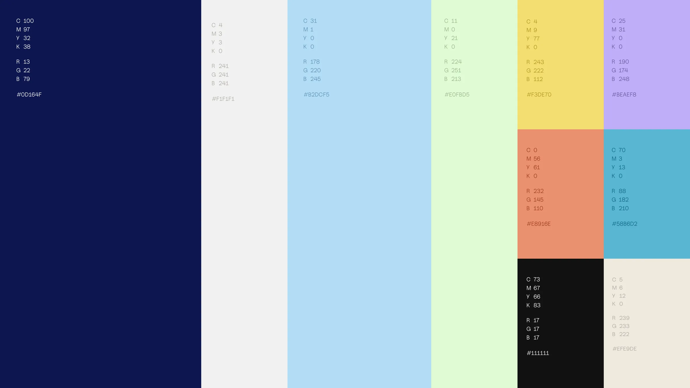
Ditto colour palette with navy, light blue, mint, yellow, lilac and coral
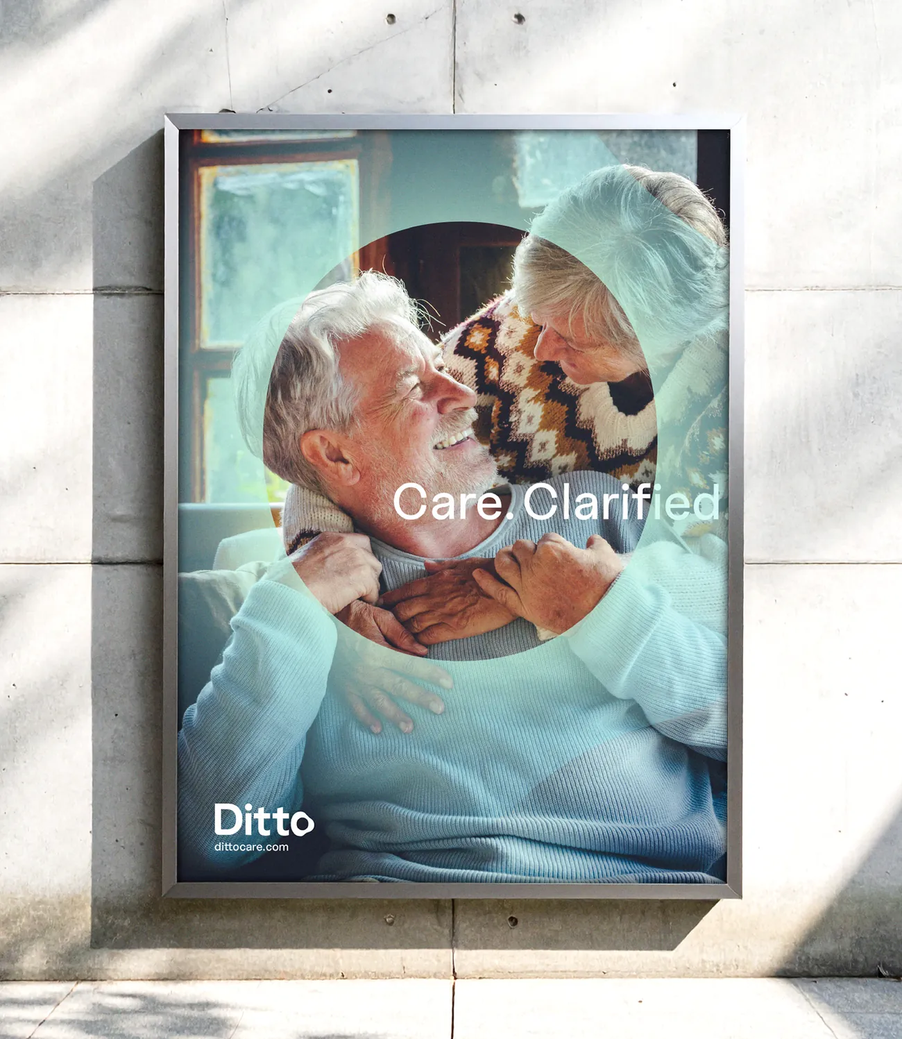
Ditto poster with an elderly couple and Care. Clarified.
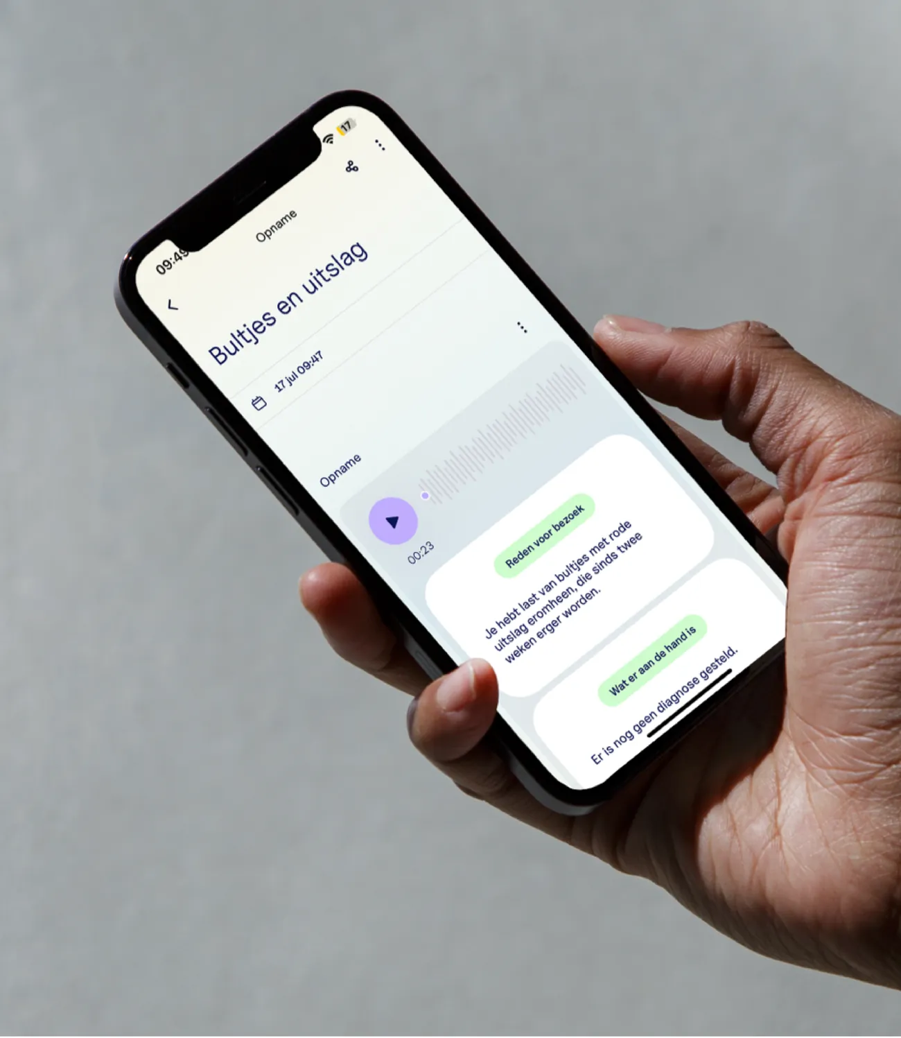
Ditto app showing a recorded doctor’s appointment and summary
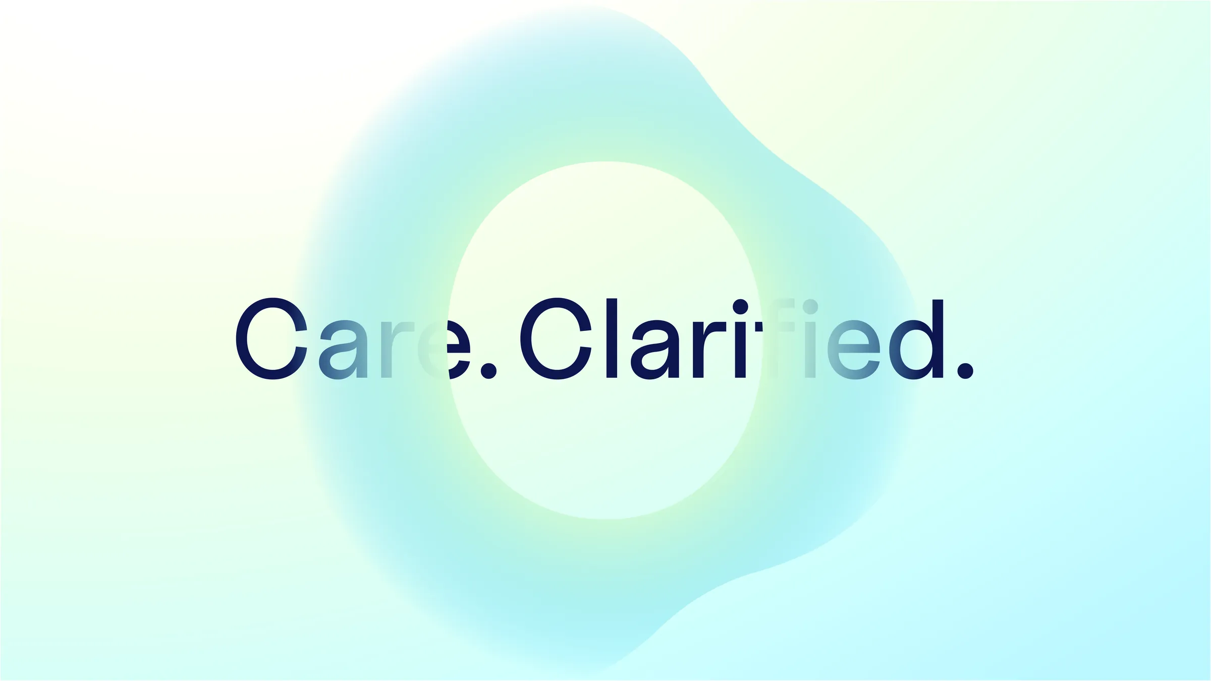
Care. Clarified. over the gradient O
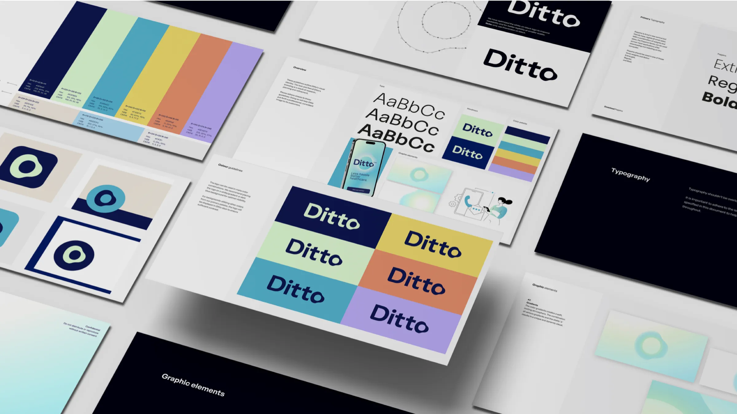
Pages from the Ditto brand guidelines
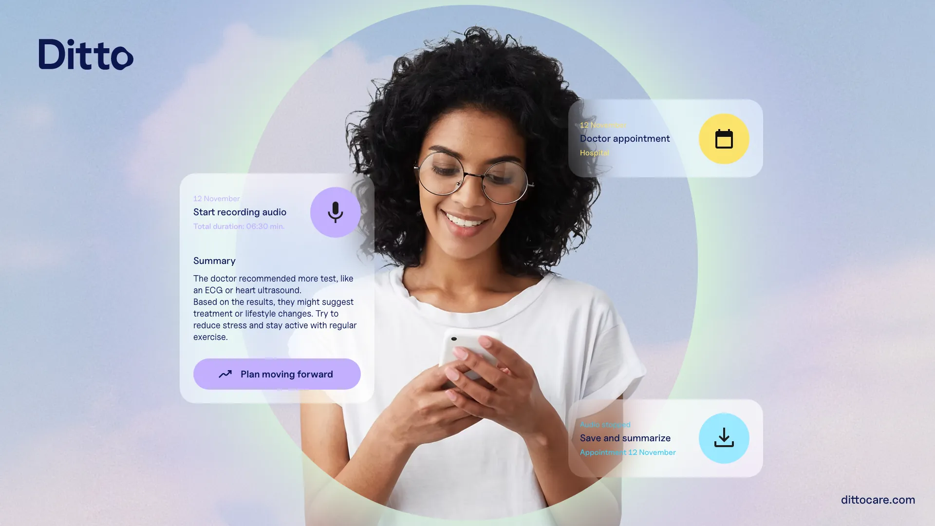
Ditto campaign visual with app cards around a woman on her phone
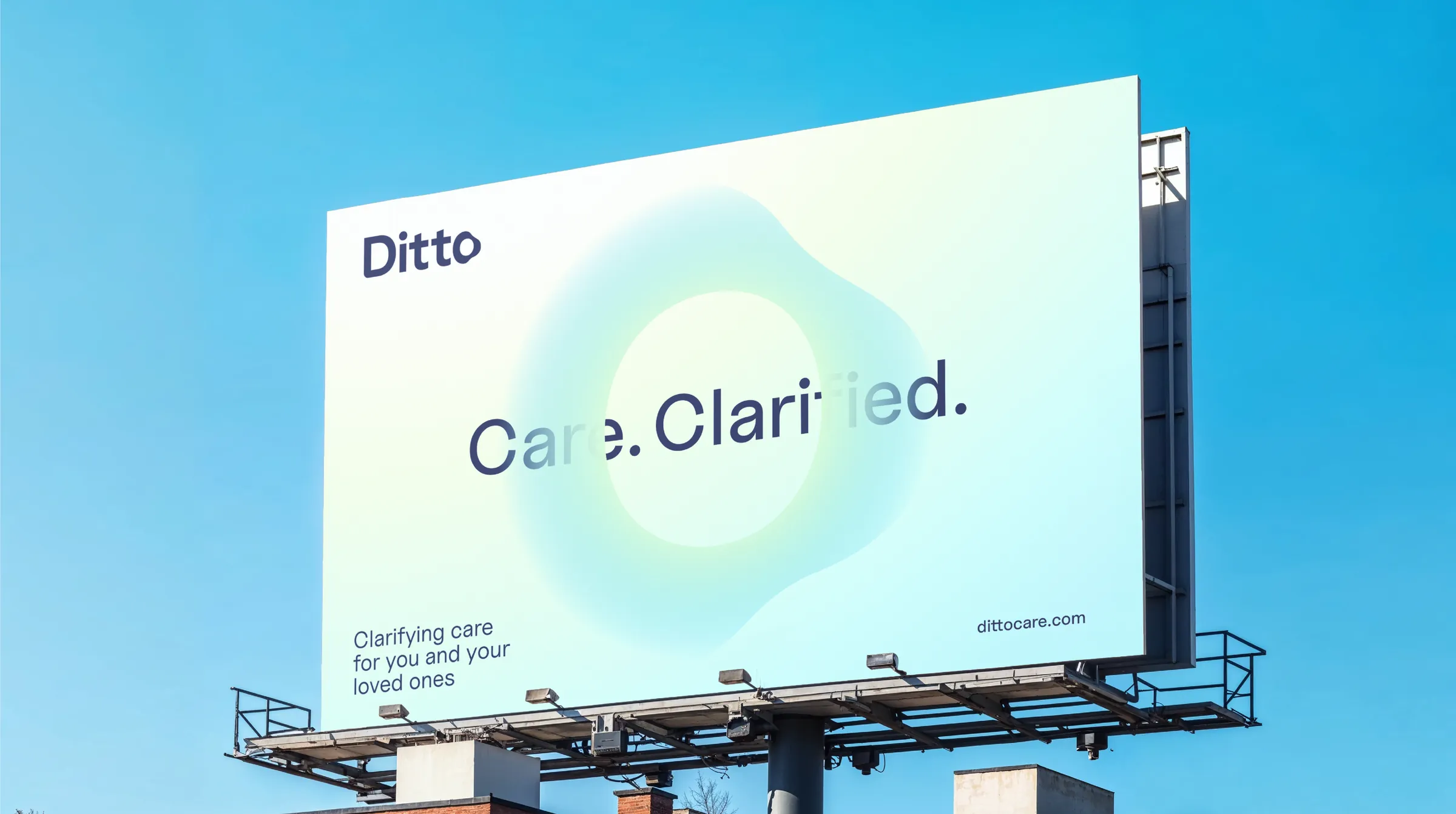
Ditto billboard on a rooftop
Client:
Ditto.Care
Lead agency:
Studio Onward
Strategy:
Paulus Egberts
Creative design:
Tim van Amerongen